Connecting the Dots: What the Dot Plot Says About Interest Rates
The Fed’s quarterly projections provide investors with insight into possible future interest rate changes, which may help shape investment expectations.

Key Takeaways
The Fed’s dot plot, published four times a year, outlines policymakers’ expectations for interest rates over time.
The placement of the dots shows whether central bankers are aligned or divided in their views on the economy and interest rates.
Investors often use the dot plot to formulate expectations about asset class performance and the economic outlook.
Investors seeking insights on interest rates often refer to the Federal Reserve’s (Fed’s) dot plot. This dot plot chart displays the Federal Open Market Committee’s (FOMC’s) projections for the target federal funds rate.
The dot plot is a tool investors use to gauge the Fed’s future rate policy. However, it’s not a guarantee of future interest rate policy. Instead, investors consult the dot plot for clues about longer-term interest rate trends.
What Is the Fed’s Dot Plot?
As part of its commitment to transparency, the Fed launched the dot plot in 2012. It’s a chart showing five sets of 19 dots, each representing a policymaker’s interest rate projections for a specific period. Figure 1 shows the Fed’s dot plot as of December 2025.
The dot plot reflects FOMC members’ rate outlooks for the current year-end, the next three years and the ambiguous “longer run.” The longer-run forecast indicates the Fed’s neutral rate — the rate that neither fuels nor restricts growth and supports full employment and 2% inflation. Each dot anonymously represents an individual member’s view of the appropriate federal funds rate.
The Fed releases the dot plot as part of its quarterly Summary of Economic Projections following the March, June, September and December FOMC meetings.
Figure 1 | FOMC’s Rate Projections at Year-End 2025
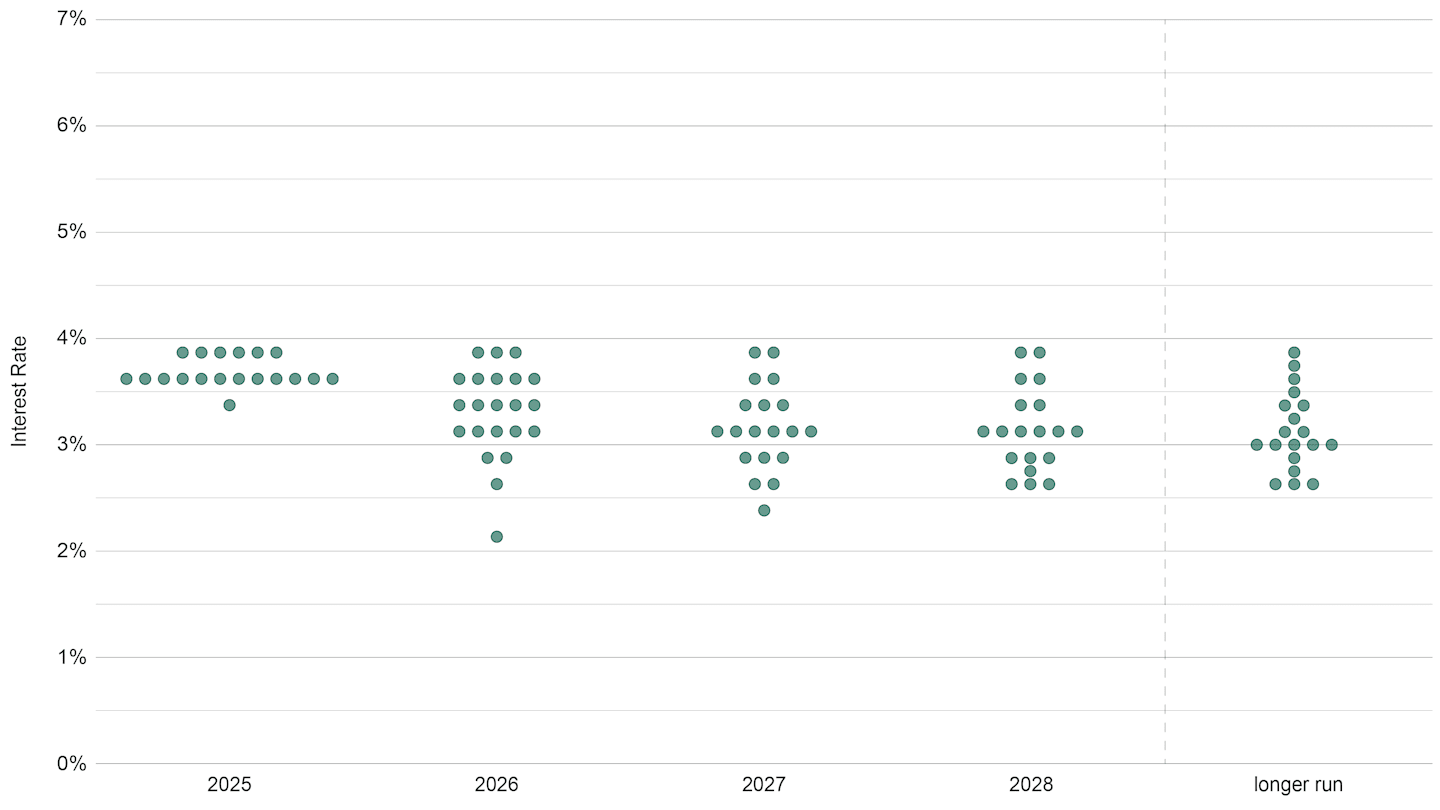
Data as of 12/31/2025. Source: Federal Reserve.
What Does the Dot Plot Tell Us?
The dot plot shows the interest rate expectations for the 19 FOMC members for the stated year-end and the longer term. 3.4% represented the median rate for 2026, suggesting most policymakers in December forecasted one interest rate cut in 2026. At year-end, the federal funds target rate was in a range of 3.5% to 3.75%.
In addition to highlighting the Fed’s rate expectations, the dot plot also shows investors how much policymaker views differ. For example, projections for year-end 2026 vary widely, from the outlier low of 2.25%, which would require several rate cuts, to a high of 3.75%. The dot plot shows similar ranges for 2027, 2028 and the longer run.
Focusing on clusters of dots generally provides the best indication of the Fed’s current thinking. For 2026, the clusters indicate that most policymakers expect rates to remain unchanged or decline slightly. And in 2027, the cluster points to modestly lower interest rates.
How Often Does the Dot Plot Change?
The Fed’s interest rate projections reflect policymakers’ best guesses about how economic data will unfold over the coming months and years. As the prevailing economic metrics change, so will the Fed’s projections. That’s why investors view the dot plot as an indicator of interest rate trends rather than a certainty.
The dot plot’s changes are usually modest. Comparing the dot plots from year-end 2024 (see Figure 2) and year-end 2025 (see Figure 1) illustrates this point.
At the end of 2024, the median rate expectation for year-end 2025 was 3.9%. While the trend proved correct, the actual fed funds rate at the end of 2025 was lower than expected. Meanwhile, the median rates for the remaining periods were unchanged from year-end 2024 to year-end 2025.
Figure 2 | FOMC’s Rate Projections at Year-End 2024
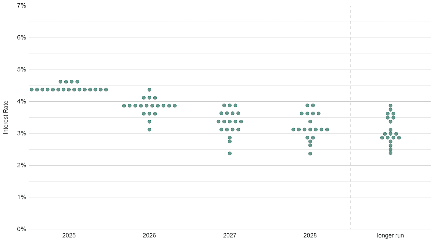
Data as of 12/31/2024. Source: Federal Reserve.
However, in times of economic turbulence, interest rate projections can vary more dramatically. For example, in 2022, the U.S. economy faced multi-year-high inflation and broad economic uncertainty. While policymakers expected rates to ease in the long run, they had wide-ranging expectations for the next three years, as Figure 3 illustrates.
Comparing Figure 3 with Figure 1 demonstrates that the Fed’s longer-run outlook for interest rates has increased from 2.5% to 3%. This is likely due to improving economic growth prospects over the last few years.
Figure 3 | Past Uncertainties Triggered a Scattered Dot Plot
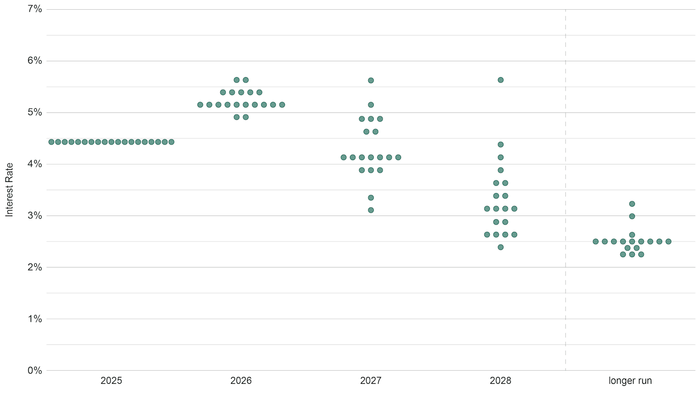
Data as of 12/31/2022. Source: Federal Reserve.
How Can the Dot Plot Help Investors?
Because rate movements affect all financial assets, investors have looked to the Fed’s dot plot to help shape outlooks and portfolio strategies. Investors may use it to:
Determine whether the Fed is leaning hawkish (raising rates and fighting inflation), dovish (lowering rates and promoting growth) or somewhere in between. This insight may help with yield curve and duration decisions, along with setting equity valuation models.
Uncover disagreements among Fed policymakers. The placement of the dots indicates whether Fed members generally agree or disagree on monetary policy. Clusters of dots typically indicate consensus, while dispersion points to uncertainty around economic data, inflation’s trajectory or the job market. Investors may adjust portfolio risk exposure based on this information.
Set asset class performance expectations. Changes in the dot plot can affect investor expectations across asset classes. Movements in the federal funds rate usually drive Treasury yields, particularly shorter-maturity securities. Rate changes also influence funding costs in the corporate bond market and valuation and growth expectations in the stock market.
It’s important to keep in mind that the dot plot is only one tool investors can use to gauge the investment landscape. Dot plot data points are forecasts and can change from quarter to quarter based on various economic metrics. However, the chart helps investors assess the Fed’s collective thinking and general trends in interest rate policy.
Authors
Fed Watch: Latest Insights on the Federal Reserve
Learn how Fed policy can influence financial market trends and affect your portfolio.
Past performance is no guarantee of future results. Investment returns will fluctuate and it is possible to lose money.
The opinions expressed are those of American Century Investments (or the portfolio manager) and are no guarantee of the future performance of any American Century Investments portfolio. This material has been prepared for educational purposes only. It is not intended to provide, and should not be relied upon for, investment, accounting, legal or tax advice.
Generally, as interest rates rise, the value of the bonds held in the fund will decline. The opposite is true when interest rates decline.