
Content Type Library
Part One

This page is a showcase for all variations of content types available in Contentful. This page utilizes the "Template > Navbar with Content" with Display Type: Top selected, which allows the sticky tab navigation to appear. We cannot use this type of navigation without this specific template. There are other template restrictions, which Sam is happy to discuss at any time depending on the problem you are trying to solve.
This first "Layout > Section" on this page's theme is Full Width Image with No Padding. We cannot overlay text on images currently in Contentful. The source image is 1920x1080 so you can see how images are automatically cropped. This second "Layout > Section" theme is "Pattern: Wavy". The "Layout > Section" theme or color automatically dictates the coloration of copy, links and buttons that appear in it.
Last updated May 2024.
Section Theme: None
This Section > Layout's theme is "None" with "Full" padding. These are the default states for this content type.
Inside of the Layout > Section, there is a Layout > Grid. The Layout > Grid controls the alignment on the Y-axis (Top align, Middle align, Bottom align). We also have an option to add a bottom margin. Bottom margin on a Layout > Grid is set to No Margin by default.
This Layout > Grid is set to Middle align with No Margin selected.
Section Theme: White
This Section > Layout's theme is "White" with "Small" padding. How is this different from None? I am not entirely sure, but they are functionally similar.
Once you have a Section > Layout with a Section > Grid inside, you can then add the last structural element of Section > Column. Columns control the X-axis spacing. We use a 12-column structure. Each column has 16px Top and Left padding. We can control the Column widths for Desktop, Tablet and Phone views. We also can add additional column offsets, which we will look at more in depth later. Desktop and Tablet have column width options 1-12 available. Phone column width options are 12-columns wide or 6-columns wide.
This current column is 8-width with no offsets.
Section Theme: Light Green
This Section > Layout's theme is "Light Green" with "Full" padding. The change in text color is automatic. This is what the link text color looks like. This is what italics text looks like. We cannot have underlined text because that is reserved exclusively for links. We can also superscript.
Section Theme: Light Gray
This Section > Layout's theme is "Light Gray" with "Full" padding. The change in text color is automatic. This is what the link text color looks like. This is what italics text looks like. We cannot have underlined text because that is reserved exclusively for links. We can also superscript.
Section Theme: Dark Green
This Section > Layout's theme is "Dark Green" with "Full" padding. The change in text color is automatic. This is what the link text color looks like. This is what italics text looks like. We cannot have underlined text because that is reserved exclusively for links. We can also superscript.
Something else to mention about Section > Layout is that we can add an Anchor Link ID. This is how we add # links to webpages. We can only have jump links like this on the Section level. We cannot add jump links randomly in the middle of a copy block for example.
Layout > Grid
The Layout > Grid content type is a structural element on a webpage. They can be placed inside Layout > Section, or even Layout > Column should a layout call for some advanced building techniques. (That can get complicated quickly, so we don't do that often!)
The Grid has a few additional styling controls. We can choose to add a bottom margin, which provides an additional 40px.
We also have column display controls for tablet and mobile. For example, if we have a 6-wide column with copy on the left and a 6-wide column with image on the right, but we want the image to appear first on Mobile, we can force the logic to display the image first instead of the copy. That is demonstrated below.
THIS grid DOES have a Bottom Margin toggled on. The grid below containing the two columns will not. Note the images touching because of that choice.
Copy Block
This copy block is inside a 5-wide column. The image is in a 6-wide column with a 1-offset.
Alignment
We can also control Vertical Alignment with the Grid content type. This grid is set to Top align. Bottom Margin is toggled On. Generally, when we are stacking multiple Grids inside of a Section, we would turn the margin on.
Middle Align
This grid set is set to Middle Align. The Bottom Margin is toggled on.
Lorem ipsum dolor sit amet, consectetur adipiscing elit, sed do eiusmod tempor incididunt ut labore et dolore magna aliqua.
Bottom Align
This grid is set to align bottom. The bottom margin is toggled on.
Layout > Column
The Layout > Column is the final structural element of a webpage. The column system goes up to 12-across. This graphic from UXUI explains it a little better:
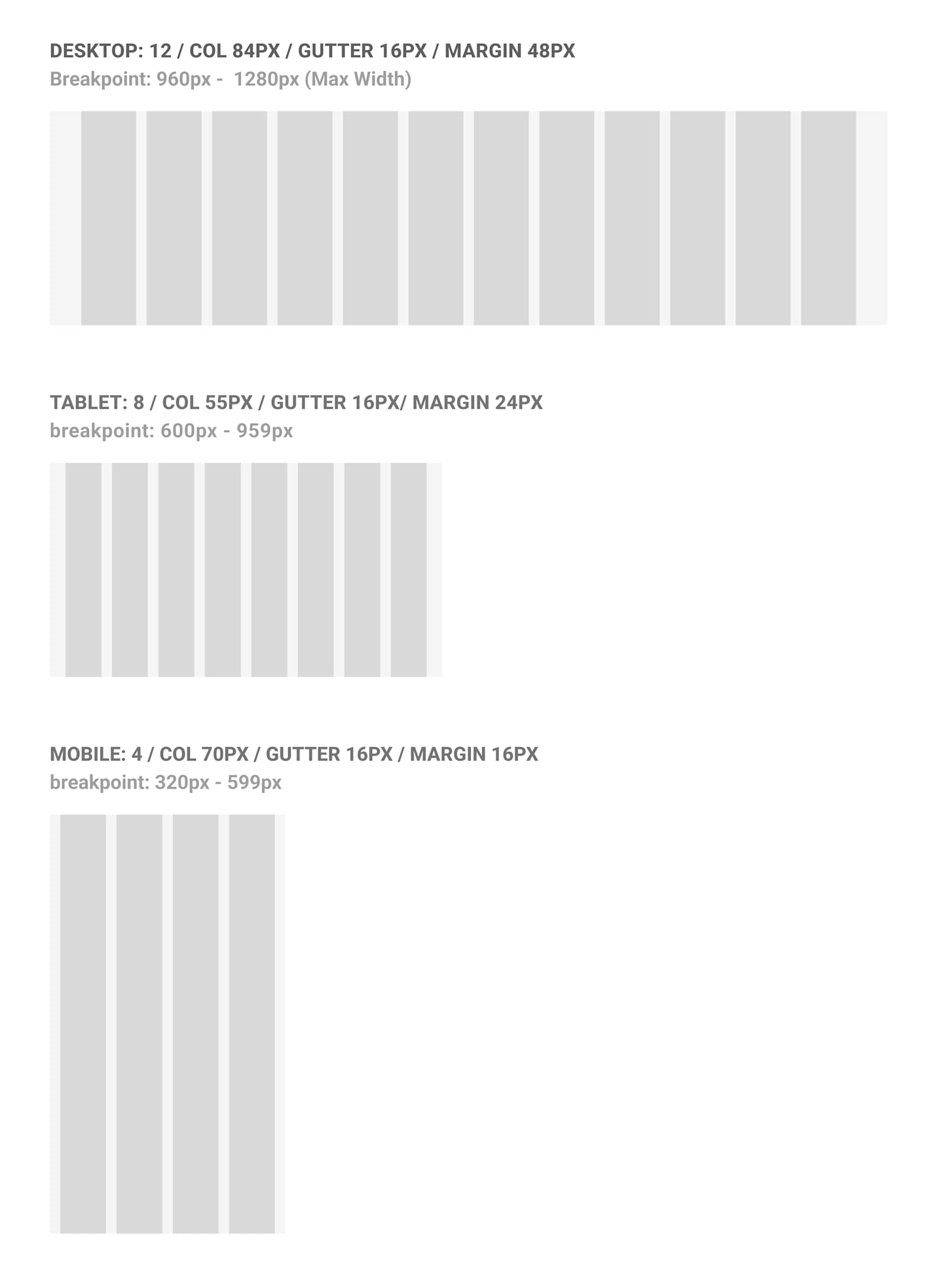
This system gives us quite a bit of flexibility when designing webpages.
12-Columns
While we can fully implement 12-columns across, like displayed below, in general we wouldn't do something like this without guidance from UXUI. We've occasionally had a need to go that small, but that's usually for a large display of logos or some other odd use case. These columns are all set to 1-wide.
Some sample copy for display purposes.
Some sample copy for display purposes.
Some sample copy for display purposes.
Some sample copy for display purposes.
Some sample copy for display purposes.
Some sample copy for display purposes.
3-Columns
This is a more typical display when we want to display some quick bite information. Kind of like how we show cards on this page.
Some sample copy for display purposes.
Some sample copy for display purposes.
4-Columns
Another common way to display some information together is with 4-wide columns.
Some sample copy for display purposes.
6-Columns
And lastly, another common set of column selection is the 6-wide side-by-side. Of course, we can accommodate any ratios as is appropriate for the content (4-wide image with a 8-wide copy block, 7-wide with 5-wide, etc.) It's just important to remember that the numbers ultimately add up to 12 if they need to stay side-by-side.
Some sample copy for display purposes.
Column Offset
In addition to choosing how wide a column is, we can also choose to add additional column offsets -- kind of like additional padding. We can do this for Tablet and Desktop view modes. We can choose from numbers 1-3 for Tablet and 1-4 for Desktop. Articles employ the offset feature the most. We add 2-offset and make the columns 8-wide for copy. This creates the "centered" effect on those kinds of builds.
I'll demonstrate the offsets below with a 4-wide copy block being offset from a 4-wide image.
1-Column Offset
This copy block is in a 4-wide column with offset set to 1 for Tablet and Desktop.
2-Column Offset
This copy block is in a 4-wide column with offset set to 2 for Tablet and Desktop.
3-Column Offset
This copy block is in a 4-wide column with offset set to 3 for Tablet and Desktop.
4-Column Offset
This copy block is in a 4-wide column with offset set to 3 for Tablet and 4 for Desktop. Tablet can only go up to 3 offset.
Accordions
Accordions have some interesting functional uses as well as some functional limitations.
We can control the width of accordions with the Layout > Column controls. We can nest up to 2 levels deep. However, we cannot use accordions on any alternative color backgrounds. We only use accordions White or None section theme colors.
Inside of a level 1 accordion, we can put in the following content types: Accordion, Copy Block, Disclosure, Footnote, Glossary Term and Video.
We can work around this limitation by embedding things inside of a Copy Block. We'll talk more about that when we look at Copy Block as a content type.
The other feature of top level accordions is that they automatically generate a jump link ID based on the Title of the accordion. For example, this accordion's link name would be accordion-set-1-with-nested-accordions. This only works for Level 1 accordions.
See Nested Accordion 2 for some additional information.
Level 2 accordions automatically open and close when there are other accordions present. We do not nest accordions deeper than 2 levels. We also tend to shy away from nesting accordions like this because it adds extra work when we submit webpages to compliance.
Support Center is a great place to see the pros and cons of nesting accordions. The Support Center also utilizes the Template > Navbar with Content, however the Navigation Display Type is set to Left.
This is here so you can see how accordions stack together.
This is here so you can see how accordions stack together.
Accordions Continued
This area is here so you can see how accordions side by side in 5-wide columns behave. In general, we wouldn't choose to do this. The accordion contents is repeated from above.
Inside of a level 1 accordion, we can put in the following content types: Accordion, Copy Block, Disclosure, Footnote, Glossary Term and Video.
We can work around this limitation by embedding things inside of a Copy Block. We'll talk more about that when we look at Copy Block as a content type.
The other feature of top level accordions is that they automatically generate a jump link ID based on the Title of the accordion. For example, this accordion's link name would be accordion-set-1-with-nested-accordions. This only works for Level 1 accordions.
See Nested Accordion 2 for some additional information.
Level 2 accordions automatically open and close when there are other accordions present. We do not nest accordions deeper than 2 levels. We also tend to shy away from nesting accordions like this because it adds extra work when we submit webpages to compliance.
Support Center is a great place to see the pros and cons of nesting accordions. The Support Center also utilizes the Template > Navbar with Content, however the Navigation Display Type is set to Left.
This is here so you can see how accordions stack together.
This is here so you can see how accordions stack together.
Action
Action content types, or Buttons, are dependent on automated logic based on the content type it is in or sometimes what color background the Section it appears in is. This section theme is White.
^These buttons are embedded in line inside of a copy block.
^This button is placed inside the column, underneath the first copy block.
^This button is toggled for "Full Width", meaning it will take on the full width of whatever column size it appears in.
Additional options we have are whether or not the Button opens in a new window and if the button is a PDF link or External link.
^These buttons were placed inside the copy block with a Regular embed. The color change logic is automatic.
We will look at some additional controls with the Promo Container. These button tests will now be displayed on alternate background colors.
Alerts
We would use an alert at the very top of a web page, or right under the heading like on a Product Page. A lot of our Templates have a spot to place an alert directly into, which controls the display logic. Otherwise, we would place an alert directly in a Layout > Section, without a Grid or Column.
All options for alerts are displayed below, first inside of a column, then inside the Section only.
This alert is an Error alert type. The title is optional. The body text here is required. We also can have links. Or bolded text. Or italic text. Even superscripts. We cannot have additional heading styles.
This alert is a Warning alert type. The title is optional. The body text here is required. We also can have links. Or bolded text. Or italic text. Even superscripts. We cannot have additional heading styles.
This alert is an Info alert type. The title is optional. The body text here is required. We also can have links. Or bolded text. Or italic text. Even superscripts. We cannot have additional heading styles.
This alert is a Success alert type. The title is optional. The body text here is required. We also can have links. Or bolded text. Or italic text. Even superscripts. We cannot have additional heading styles.
Color Card Links on Light Gray
Card
The card is a nice content type to have a bit of a pop for a short bit of information or promote a link. A lot of our "evergreen" type content pages utilize cards. With the options we do have, we have a bit of room for some interesting design choices when you play with card color and section background color.
The biggest "warning" on the Card content type is that it can only be by itself in a Column. If you try to stack other things with the Card like a copy block or button, the background logic breaks and creates a visual error (which I will NOT be demonstrating here).
This is a White Background Card
This is a Light Gray Background Card
This is a Light Green Background Card
White Background with Icon
Light Gray Background with Icon
Light Green Background with Icon
White Background with Icon & Text
Some additional text can also go here. No additional text styling can be used inside of a card.
Light Gray Background with Icon & Text
Some additional text can also go here.
Light Green Background with Icon & Text
When cards are in a row like this together, there is logic in place to keep their heights consistent no matter the variances on the amount of copy or length of the Card Title.
White Background with Icon, Text & Link
The only required fields are Background Color and Card Title.
Light Gray Background with Icon, Text & Link
Cards can fit in any size column, but in general we don't go below 3-wide.
Light Green Background with Icon, Text & Link
We have a pre-populated icon library from Material UI that we pick from. We generally don't allow outside icons to preserve consistency.
6-Columns Wide
A different view we commonly do.
6-Columns Wide
Sometimes we do 4x4 stacks also.
12-Columns Wide
We can do any column width for cards. We might choose to do a 12-column wide card if we had the content to support it.
Otherwise, there is a lot of empty space that we generally try to avoid.
Cards on Light Green
This is a White Background Card
This is a Light Gray Background Card
This is a Light Green Background Card
White Background with Icon
Light Gray Background with Icon
Light Green Background with Icon
White Background with Icon & Text
Some additional text can also go here. No additional text styling can be used inside of a card.
Light Gray Background with Icon & Text
Some additional text can also go here.
Light Green Background with Icon & Text
When cards are in a row like this together, there is logic in place to keep their heights consistent no matter the variances on the amount of copy or length of the Card Title.
White Background with Icon, Text & Link
The only required fields are Background Color and Card Title.
Light Gray Background with Icon, Text & Link
Cards can fit in any size column, but in general we don't go below 3-wide.
Light Green Background with Icon, Text & Link
We have a pre-populated icon library from Material UI that we pick from. We generally don't allow outside icons to preserve consistency.
6-Columns Wide
A different view we commonly do.
6-Columns Wide
Sometimes we do 4x4 stacks also.
12-Columns Wide
We can do any column width for cards. We might choose to do a 12-column wide card if we had the content to support it.
Otherwise, there is a lot of empty space that we generally try to avoid.
Cards on Light Gray
This is a White Background Card
This is a Light Gray Background Card
This is a Light Green Background Card
White Background with Icon
Light Gray Background with Icon
Light Green Background with Icon
White Background with Icon & Text
Some additional text can also go here. No additional text styling can be used inside of a card.
Light Gray Background with Icon & Text
Some additional text can also go here.
Light Green Background with Icon & Text
When cards are in a row like this together, there is logic in place to keep their heights consistent no matter the variances on the amount of copy or length of the Card Title.
White Background with Icon, Text & Link
The only required fields are Background Color and Card Title.
Light Gray Background with Icon, Text & Link
Cards can fit in any size column, but in general we don't go below 3-wide.
Light Green Background with Icon, Text & Link
We have a pre-populated icon library from Material UI that we pick from. We generally don't allow outside icons to preserve consistency.
6-Columns Wide
A different view we commonly do.
6-Columns Wide
Sometimes we do 4x4 stacks also.
12-Columns Wide
We can do any column width for cards. We might choose to do a 12-column wide card if we had the content to support it.
Otherwise, there is a lot of empty space that we generally try to avoid.
Cards on Dark Green
We would not do this. Card colorways on Dark Green was not part of original design requirements.
This is a White Background Card
This is a Light Gray Background Card
This is a Light Green Background Card
White Background with Icon
Light Gray Background with Icon
Light Green Background with Icon
White Background with Icon & Text
Some additional text can also go here. No additional text styling can be used inside of a card.
Light Gray Background with Icon & Text
Some additional text can also go here.
Light Green Background with Icon & Text
When cards are in a row like this together, there is logic in place to keep their heights consistent no matter the variances on the amount of copy or length of the Card Title.
White Background with Icon, Text & Link
The only required fields are Background Color and Card Title.
Light Gray Background with Icon, Text & Link
Cards can fit in any size column, but in general we don't go below 3-wide.
Light Green Background with Icon, Text & Link
We have a pre-populated icon library from Material UI that we pick from. We generally don't allow outside icons to preserve consistency.
6-Columns Wide
A different view we commonly do.
6-Columns Wide
Sometimes we do 4x4 stacks also.
12-Columns Wide
We can do any column width for cards. We might choose to do a 12-column wide card if we had the content to support it.
Otherwise, there is a lot of empty space that we generally try to avoid.
Color Card Links
Currently, we only use these on the main homepage, the Institutional homepage and Support Center landing page as a form of alternative navigation. These are a pretty basic and straight forward content type with few options.
Icons are optional. Link is required. Web Ops would not venture out to use these without strict guidance from UXUI on design. If anything, we may use the Gray option, but generally the Card content type suits the job better.
Color Card Links on Light Green
Color Card Links on Dark Green
Copy Block
The copy block is a humble content type, but is the functional back bone of many webpages. With the ability to style text, link text, embed tables, and embed a number of other content types the copy block is the content type we use the absolute most.
In copy blocks, we can embed Action, Disclosure, Factoid, Footnote, Highlight, Image, Markdown Content and Person content types. They also fit inside all column widths.
Available Heading and Text Styles
Heading 1
Heading 2
Heading 3
Heading 4
Heading 5
Heading 6
Bold
Italics
Not-SuperscriptSuperscript
We Can't Add Links to Headings
Bullet 1
Bullet 2
Bullet 3
Number 1
Number 2
Number 3
Tables in Copy Block: Default
Tables have limited controls in the copy block. What you see below is about all we can do.
Tables in Copy Block: Compare
This table display type was developed for the advice webpage. It can come in handy for tables that feature a lot of content but 3-5 columns. The styling is all automated.
Tables in Copy Block: Data
The data table style is for tables that feature a lot of data, but is limited on copy preferably. The column maximum for tables is 10.
Disclosure
Disclosures are required messaging found at the bottom of almost every web page. The compliance department provides guidance on which disclosures to add to a webpage.
Web Ops manages almost all of the disclosures on our web site. We treat them like reusable puzzle pieces so that if there is an update in the future, updating the disclosure on one page will update it everywhere. We try to not use these for text styling purposes when building a webpage as we want to keep our Disclosure content type library as clean as possible.
We have a few styles available.
This is a default-styled disclosure. We use disclosures like puzzle pieces on webpages so that if a change needs to be made, we can update this once and it will update everywhere the disclosure will appear. Links work here also .
This is a small-styled disclosure. We use disclosures like puzzle pieces on webpages so that if a change needs to be made, we can update this once and it will update everywhere the disclosure will appear. Links work here also .
This is a black-styled disclosure. We use disclosures like puzzle pieces on webpages so that if a change needs to be made, we can update this once and it will update everywhere the disclosure will appear. Links work here also .
Continue Exploring the Contentful Content Type Library
Last Updated May 2024. For internal use only.
For a more robust look at how Dev tries to break and test content types, check out Carmen Phu's Flexible Component's Test Page. The American Century ACDS is another great resource.