
Event
The event content type is mainly used on homepages. There is a part of the Template > Homepage that the event content type fits into. When on a homepage, once the event concludes, the content type automatically stops appearing. However, the content type does remain on the "back end" of the webpage.
The automatic removal does not work when placed on a template of any other kind.
Oct 31, 2024
4:15
AM. EST
EST Event Time Zone: This event title is required
The event short description is entirely optional. We do not have any advanced text styles or controls available in this field.
Nov 30, 2024
6:30
AM. CST
CST Event Time Zone: This event title is required
The event short description is entirely optional. We do not have any advanced text styles or controls available in this field.
Nov 16, 2024
5:00
PM. PST
PST Event Time Zone: This event title is required
The event short description is entirely optional. We do not have any advanced text styles or controls available in this field.
Factoid
The factoid is a simple content type with limited controls. It can be embedded in a copy block, or live in a column by itself. It conforms to the size of the column it is placed. We have no advanced text controls (i.e. bold, italics, line breaks, links, superscript, etc.)
Feature List
The feature list is an engaging way to display information in a list format. We have a handful of controls available. The feature list content type is a shell that holds the Copy Block content type, meaning we do have full text control capabilities. However, guidance from UXUI dictates we use H4 for the heading and regular copy for the supporting text.
If we got too crazy embedding things in the Feature List content type, we may also run into display errors -- especially with the un-ordered list type.
The feature list conforms to the width of the column it is placed in. However, it is not recommended to place it in a column smaller than 4-wide.
Ordered List with Vertical Display
Lorem ipsum dolor sit amet, consectetur adipiscing elit, sed do eiusmod tempor incididunt ut labore et dolore magna aliqua. Potenti nullam ac tortor vitae purus. Sed odio morbi quis commodo odio aenean. Ultrices mi tempus imperdiet nulla malesuada pellentesque elit eget. Adipiscing at in tellus integer feugiat scelerisque varius. Gravida rutrum quisque non tellus. Mauris ultrices eros in cursus turpis massa. Elementum pulvinar etiam non quam lacus suspendisse faucibus. Mi sit amet mauris commodo quis imperdiet massa tincidunt nunc. Adipiscing enim eu turpis egestas.
Ordered List with Vertical Display
Lorem ipsum dolor sit amet, consectetur adipiscing elit, sed do eiusmod tempor incididunt ut labore et dolore magna aliqua. Potenti nullam ac tortor vitae purus. Sed odio morbi quis commodo odio aenean. Ultrices mi tempus imperdiet nulla malesuada pellentesque elit eget. Adipiscing at in tellus integer feugiat scelerisque varius. Gravida rutrum quisque non tellus.
Ordered List with Horizontal Display
The ordered list with horizontal display has automated logic to space the elements across the page.
Ordered List with Horizontal Display
Lorem ipsum dolor sit amet, consectetur adipiscing elit, sed do eiusmod tempor incididunt ut labore et dolore magna aliqua. Potenti nullam ac tortor vitae purus. Sed odio morbi quis commodo odio aenean.
Ordered List with Horizontal Display
Lorem ipsum dolor sit amet, consectetur adipiscing elit, sed do eiusmod tempor incididunt ut labore et dolore magna aliqua. Potenti nullam ac tortor vitae purus. Sed odio morbi quis commodo odio aenean.
Ordered List with Horizontal Display
Lorem ipsum dolor sit amet, consectetur adipiscing elit, sed do eiusmod tempor incididunt ut labore et dolore magna aliqua. Potenti nullam ac tortor vitae purus. Sed odio morbi quis commodo odio aenean.
Ordered List with Horizontal Display
Lorem ipsum dolor sit amet, consectetur adipiscing elit, sed do eiusmod tempor incididunt ut labore et dolore magna aliqua. Potenti nullam ac tortor vitae purus. Sed odio morbi quis commodo odio aenean.
Unordered List with Vertical Display
There is no background on the Feature List content type. It displays on background colors as you would expect.
Unordered List with Vertical Display
Lorem ipsum dolor sit amet, consectetur adipiscing elit, sed do eiusmod tempor incididunt ut labore et dolore magna aliqua. Potenti nullam ac tortor vitae purus. Sed odio morbi quis commodo odio aenean.
Unordered List with Vertical Display
Lorem ipsum dolor sit amet, consectetur adipiscing elit, sed do eiusmod tempor incididunt ut labore et dolore magna aliqua. Potenti nullam ac tortor vitae purus. Sed odio morbi quis commodo odio aenean.
Footnote
The footnote content type houses Copy Blocks, Disclosures, and Glossary Terms in order to facilitate automatic Number, Lettering, or Asterisks based on their position inside the content type. This removed a bit of manual work for Web Ops.
However, because of this, we cannot blend numbers, letters and asterisks together. Everything must be in ascending order.
This is a copy block placed inside the Footnote content type.
This is a default-styled disclosure. We use disclosures like puzzle pieces on webpages so that if a change needs to be made, we can update this once and it will update everywhere the disclosure will appear. Links work here also .
This is a copy block placed inside the Footnote content type, but now with letters.
This is a small-styled disclosure. We use disclosures like puzzle pieces on webpages so that if a change needs to be made, we can update this once and it will update everywhere the disclosure will appear. Links work here also .
This is a copy block placed inside the Footnote content type, but now with letters.
This is a copy block placed inside the Footnote content type, but now with asterisks.
This is a default-styled disclosure. We use disclosures like puzzle pieces on webpages so that if a change needs to be made, we can update this once and it will update everywhere the disclosure will appear. Links work here also .
This is a copy block placed inside the Footnote content type, but now with asterisks.
Glossary Term
Glossary Term is a unique content type that allows us to have jump links to specific terms in the American Century Glossary page. If you remember from the Section > Layouts and Accordions, normally that is the only place we can make jump links. However, the Glossary page needed to be able to have terms linked to specifically.
Here's an example if compliance requested we link to the term duration.
The Glossary Term content type allows up to provide multiple anchor link IDs. We can have up to 3 anchor link IDs per entry. This allows us to account for historical jump link IDs that had capitalization while also introducing lowercase variations of terms as that is our standard moving forward.
We can bold, italicize, and even have links in the Glossary Term content type.
Highlight
The highlight is another commonly used content type. It's a simple way to display secondary call outs or provide a list of resources. We also use this content type to build the Key Takeaways section on articles.
We have a handful of variations available: White or Gray Background, Optional Title, and Optional Icon. The icon library is the same as what is available for the Card content type.
The other reason this content type is widely used is because it can be embedded into a copy block. This can help reduce the number of content types we use to build webpages. Similarly to the Card, it also has logic to ensure highlights that appear side by side have the same height.
Text and background color selection are the only required fields. We can bold text, italicize text, superscript, link text and have bold link text.
- Lists also work
- Like this
- Or like this
- List item
Text and background color selection are the only required fields. We can bold text, italicize text, superscript, link text and have bold link text.
- Lists also work
- Like this
- Or like this
- List item
Text and background color selection are the only required fields. We can bold text, italicize text, superscript, link text and have bold link text.
- Lists also work
- Like this
- Or like this
- List item
Text and background color selection are the only required fields. We can bold text, italicize text, superscript, link text and have bold link text.
- Lists also work
- Like this
- Or like this
- List item
This is a None background with icon and no title. Text and background color selection are the only required fields. We can bold text, italicize text, superscript, link text and have bold link text.
- Lists also work
- Like this
- Or like this
- List item
This is a Light Gray background with icon and no title. Text and background color selection are the only required fields. We can bold text, italicize text, superscript, link text and have bold link text.
- Lists also work
- Like this
- Or like this
- List item
This is a None background with icon and title. Text and background color selection are the only required fields. We can bold text, italicize text, superscript, link text and have bold link text.
- Lists also work
- Like this
- Or like this
- List item
This is a Light Gray background with icon and title. Text and background color selection are the only required fields. We can bold text, italicize text, superscript, link text and have bold link text.
- Lists also work
- Like this
- Or like this
- List item
This is to demonstrate how highlights behave when embedded into a copy block that is 12-columns wide. If we have a paragraph return between highlights, they display as separate entities. If we do not have a paragraph return between highlights, we can simulate a unified background without having to built an entirely new Section + Grid + Column combo. This helps up streamline the number of content types used for a build.
This is a None background with icon and title. Text and background color selection are the only required fields. We can bold text, italicize text, superscript, link text and have bold link text.
- Lists also work
- Like this
- Or like this
- List item
This is a Light Gray background with icon and title. Text and background color selection are the only required fields. We can bold text, italicize text, superscript, link text and have bold link text.
- Lists also work
- Like this
- Or like this
- List item
Highlight on Light Green
Text and background color selection are the only required fields. We can bold text, italicize text, superscript, link text and have bold link text.
- Lists also work
- Like this
- Or like this
- List item
Text and background color selection are the only required fields. We can bold text, italicize text, superscript, link text and have bold link text.
- Lists also work
- Like this
- Or like this
- List item
Text and background color selection are the only required fields. We can bold text, italicize text, superscript, link text and have bold link text.
- Lists also work
- Like this
- Or like this
- List item
Text and background color selection are the only required fields. We can bold text, italicize text, superscript, link text and have bold link text.
- Lists also work
- Like this
- Or like this
- List item
This is a None background with icon and no title. Text and background color selection are the only required fields. We can bold text, italicize text, superscript, link text and have bold link text.
- Lists also work
- Like this
- Or like this
- List item
This is a Light Gray background with icon and no title. Text and background color selection are the only required fields. We can bold text, italicize text, superscript, link text and have bold link text.
- Lists also work
- Like this
- Or like this
- List item
This is a None background with icon and title. Text and background color selection are the only required fields. We can bold text, italicize text, superscript, link text and have bold link text.
- Lists also work
- Like this
- Or like this
- List item
This is a Light Gray background with icon and title. Text and background color selection are the only required fields. We can bold text, italicize text, superscript, link text and have bold link text.
- Lists also work
- Like this
- Or like this
- List item
This is to demonstrate how highlights behave when embedded into a copy block that is 12-columns wide. If we have a paragraph return between highlights, they display as separate entities. If we do not have a paragraph return between highlights, we can simulate a unified background without having to built an entirely new Section + Grid + Column combo. This helps up streamline the number of content types used for a build.
This is a None background with icon and title. Text and background color selection are the only required fields. We can bold text, italicize text, superscript, link text and have bold link text.
- Lists also work
- Like this
- Or like this
- List item
This is a Light Gray background with icon and title. Text and background color selection are the only required fields. We can bold text, italicize text, superscript, link text and have bold link text.
- Lists also work
- Like this
- Or like this
- List item
Highlight on Light Gray
Text and background color selection are the only required fields. We can bold text, italicize text, superscript, link text and have bold link text.
- Lists also work
- Like this
- Or like this
- List item
Text and background color selection are the only required fields. We can bold text, italicize text, superscript, link text and have bold link text.
- Lists also work
- Like this
- Or like this
- List item
Text and background color selection are the only required fields. We can bold text, italicize text, superscript, link text and have bold link text.
- Lists also work
- Like this
- Or like this
- List item
Text and background color selection are the only required fields. We can bold text, italicize text, superscript, link text and have bold link text.
- Lists also work
- Like this
- Or like this
- List item
This is a None background with icon and no title. Text and background color selection are the only required fields. We can bold text, italicize text, superscript, link text and have bold link text.
- Lists also work
- Like this
- Or like this
- List item
This is a Light Gray background with icon and no title. Text and background color selection are the only required fields. We can bold text, italicize text, superscript, link text and have bold link text.
- Lists also work
- Like this
- Or like this
- List item
This is a None background with icon and title. Text and background color selection are the only required fields. We can bold text, italicize text, superscript, link text and have bold link text.
- Lists also work
- Like this
- Or like this
- List item
This is a Light Gray background with icon and title. Text and background color selection are the only required fields. We can bold text, italicize text, superscript, link text and have bold link text.
- Lists also work
- Like this
- Or like this
- List item
This is to demonstrate how highlights behave when embedded into a copy block that is 12-columns wide. If we have a paragraph return between highlights, they display as separate entities. If we do not have a paragraph return between highlights, we can simulate a unified background without having to built an entirely new Section + Grid + Column combo. This helps up streamline the number of content types used for a build.
This is a None background with icon and title. Text and background color selection are the only required fields. We can bold text, italicize text, superscript, link text and have bold link text.
- Lists also work
- Like this
- Or like this
- List item
This is a Light Gray background with icon and title. Text and background color selection are the only required fields. We can bold text, italicize text, superscript, link text and have bold link text.
- Lists also work
- Like this
- Or like this
- List item
Highlight on Dark Green
Text and background color selection are the only required fields. We can bold text, italicize text, superscript, link text and have bold link text.
- Lists also work
- Like this
- Or like this
- List item
Text and background color selection are the only required fields. We can bold text, italicize text, superscript, link text and have bold link text.
- Lists also work
- Like this
- Or like this
- List item
Text and background color selection are the only required fields. We can bold text, italicize text, superscript, link text and have bold link text.
- Lists also work
- Like this
- Or like this
- List item
Text and background color selection are the only required fields. We can bold text, italicize text, superscript, link text and have bold link text.
- Lists also work
- Like this
- Or like this
- List item
This is a None background with icon and no title. Text and background color selection are the only required fields. We can bold text, italicize text, superscript, link text and have bold link text.
- Lists also work
- Like this
- Or like this
- List item
This is a Light Gray background with icon and no title. Text and background color selection are the only required fields. We can bold text, italicize text, superscript, link text and have bold link text.
- Lists also work
- Like this
- Or like this
- List item
This is a None background with icon and title. Text and background color selection are the only required fields. We can bold text, italicize text, superscript, link text and have bold link text.
- Lists also work
- Like this
- Or like this
- List item
This is a Light Gray background with icon and title. Text and background color selection are the only required fields. We can bold text, italicize text, superscript, link text and have bold link text.
- Lists also work
- Like this
- Or like this
- List item
This is to demonstrate how highlights behave when embedded into a copy block that is 12-columns wide. If we have a paragraph return between highlights, they display as separate entities. If we do not have a paragraph return between highlights, we can simulate a unified background without having to built an entirely new Section + Grid + Column combo. This helps up streamline the number of content types used for a build.
This is a None background with icon and title. Text and background color selection are the only required fields. We can bold text, italicize text, superscript, link text and have bold link text.
- Lists also work
- Like this
- Or like this
- List item
This is a Light Gray background with icon and title. Text and background color selection are the only required fields. We can bold text, italicize text, superscript, link text and have bold link text.
- Lists also work
- Like this
- Or like this
- List item
Image
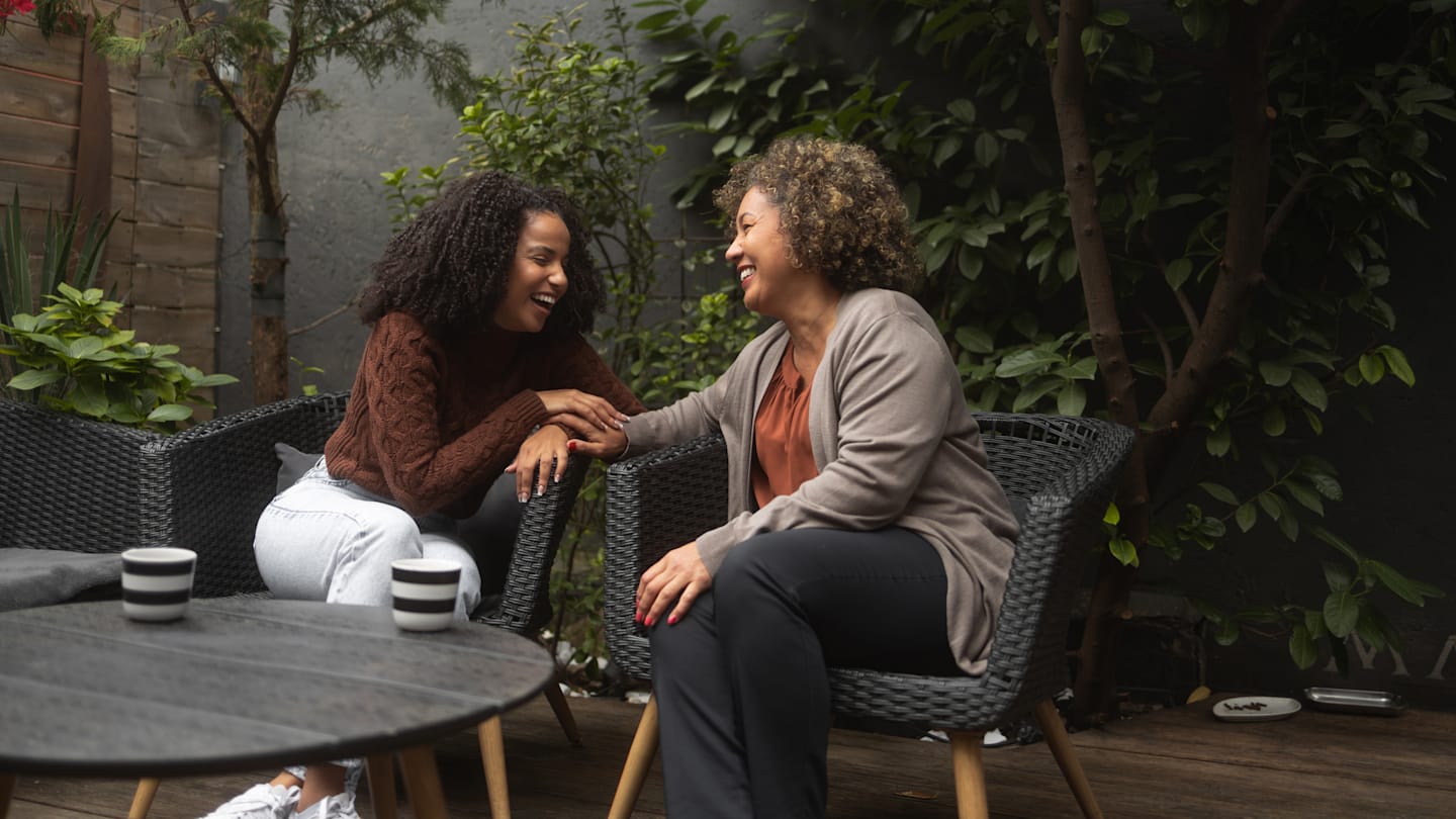
The image content type is a straight forward content type that connects the website to our digital asset management tool, Cloudinary. We can assign optional Alt Text. The only additional controls we have are to choose to use image size. We would use that control if we wanted to be specific about the size of an image, like the one embedded in the copy block below.
We can use jpg, png, gif, and svg file types. This image below is placed inside the column underneath this copy block.
Image Ratios
We have a selection of preferred ratios, depending on where the image will be used.
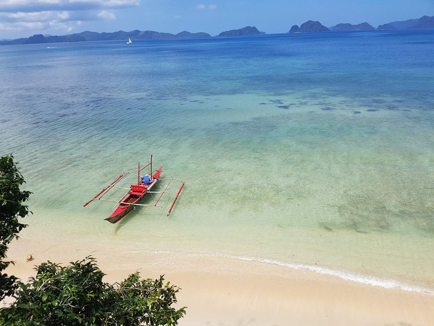
16:5
This ratio is used for hero images, including the homepage. Below is an example. When possible, we also prefer figures and charts to be in this ratio.

16:9
The most common ratio we use is 16:9. You may more commonly recognize this as 1920x1080px. We use these for Press Releases, Insights Articles and as the base for SEO/Peer Through images. When possible, we also prefer figures and charts to be in this ratio.
4:3
Another acceptable ratio is 4:3. If you wanted an image in the body copy of the page, this would be one preferred ratio. The Related Links and Auto Related Article content types also take the SEO Image and automatically crop to this ratio.
1:1 (Square)
The final preferred ratio is 1:1, or square. We utilize this ratio a lot on landing pages, particularly when we are laying out copy with it side by side. The Sustainability page is the best example of this technique.
A cool thing about Cloudinary is that we can take any sized image and inject it onto the webpage as a square!

Wrapper > Image
We also have the Wrapper > Image content type. This allows us to have consistent styling for figures and images on webpages that require a title and a source. The Wrapper > Image content type obeys the width of the column it appears in.
This is the Display Title Field. It Is Optional.
This is the caption space for an image. It is optional. It allows us to bold text, italicize text or have links .
Person
The person content type allows us to have one puzzle piece for an employee or author and utilize it in multiple places. Where -- aka what template -- the person content type is placed automatically updates how it is displayed. When we drop a person content type on a regular page like this, only the circle image, title and bio link (if available) are populated.
However, if you look at a page built with the biography template, that same person content type is styled much differently.
Further, if you look at product page or a strategy page, you will see that Firm Start Year and Industry Start Year display. This is a function of the Template > Product and Template > Strategy types. Lastly, take a look at an article page. The person content type allows the authors' name to appear in the byline as well as automatically populate at the bottom of the article in the "authors" section.
By having one person content type used functionally in several areas, this makes maintenance of web pages a lot nicer.
Promo Container
The promo container appears on almost every single web page on the site. We try to reinforce "calls to action" to encourage visitors to remain on the website. The Template > Article has a spot where we directly place the promo container inside the template. Otherwise, we can incorporate a promo container in the middle of the webpage with standard column controls. Further, we can make a container background span the entire webpage by utilizing Layout > Section controls.
There is also automated button logic for Primary and Secondary colorways. Similar to other content types like Feature List or Footnote, the Promo Container is a "shell" that we can drop other content types into, like Image, Copy Block and Action. The order that the additional content types are placed inside dictates how the promo container will render.
We have Light Green and Dark Green color options available. Transparent is also an option, but that is for special use cases only.
An additional note is that if an Image is used, it will automatically be cropped by the promo container into a square. A fun work-around is to use a PNG image to simulate different sizes or create a drop shadow effect.
Let's Look At Some Basic Button and Button Position Options First
Standard Promo - Light Green
This is a copy block, so we have all the controls you would expect. However, this stylization is the most common as we use it on Insights articles.
Standard Promo - Dark Green
This is a copy block, so we have all the controls you would expect. However, this stylization is the most common as we use it on Insights articles.
Standard Promo - Light Green 2 Buttons Default
This is a copy block, so we have all the controls you would expect. The Override CTA Styles is set to default.
Standard Promo - Dark Green 2 Buttons Default
This is a copy block, so we have all the controls you would expect. The Override CTA Styles is set to default.
Standard Promo - Light Green 2 Buttons Primary
This is a copy block, so we have all the controls you would expect. The Override CTA Styles is set to Primary.
Standard Promo - Dark Green 2 Buttons Primary
This is a copy block, so we have all the controls you would expect. The Override CTA Styles is set to Primary.
Standard Promo - Light Green 2 Buttons Secondary
This is a copy block, so we have all the controls you would expect. The Override CTA Styles is set to Secondary.
Standard Promo - Dark Green 2 Buttons Secondary
This is a copy block, so we have all the controls you would expect. The Override CTA Styles is set to Secondary.
Standard Promo - Light Green Position Right
This is a copy block, so we have all the controls you would expect. The CTA position is set to "Right".
Standard Promo - Dark Green Position Right
This is a copy block, so we have all the controls you would expect. The CTA position is set to "Right".
Standard Promo - Light Green Position Right with 2 Buttons
This is a copy block, so we have all the controls you would expect. The CTA position is set to "Right". This is with two buttons with override CTA styles set to default. We likely wouldn't do this without guidance from UXUI.
Standard Promo - Dark Green Position Right with 2 Buttons
This is a copy block, so we have all the controls you would expect. The CTA position is set to "Right". This is with two buttons with override CTA styles set to default. We likely wouldn't do this without guidance from UXUI.
Now let's look at Promo Container with Icon Options
This uses the same Material UI Library Icon picker, like the Highlight, Card and Color Card Link content types do.
Light Green with Icon Left
This promo container has image display set to Left and an Icon selected. Icons can ONLY appear on the Left side of the promo container.
Light Green with Icon Left & Position Right
This promo container has image display set to Left and an Icon selected. The CTA position is set to Right.
Dark Green with Icon Left
This promo container has image display set to Left and an Icon selected. Icons can ONLY appear on the Left side of the promo container.
Dark Green with Icon Left & Position Right
This promo container has image display set to Left and an Icon selected. The CTA position is set to Right.
Now let's look at Promo Containers with images
Reminder that any image will automatically crop to a square. Using PNG for a style work around is an option.

Light Green with Image Left
This promo container has image display set to Left and an Image place inside first. The ordering of content types within a promo container is important.
Light Green with Image Right
This promo container has image display set to Right and an Image place inside first. The ordering of content types within a promo container is important.
Dark Green with Image Left
This promo container has image display set to Left and an Image place inside first. The ordering of content types within a promo container is important.
Dark Green with Image Right
This promo container has image display set to Right and an Image place inside first. The ordering of content types within a promo container is important.
Promo Containers obey the width of the column they are in
Light Green with Image Left
This promo container has image display set to Left and an Image place inside first. The ordering of content types within a promo container is important.
Standard Promo - Dark Green
This is a copy block, so we have all the controls you would expect. However, this stylization is the most common as we use it on Insights articles.
Promo Container on Light Green
Standard Promo - Light Green
This is a copy block, so we have all the controls you would expect. However, this stylization is the most common as we use it on Insights articles.
Standard Promo - Dark Green
This is a copy block, so we have all the controls you would expect. However, this stylization is the most common as we use it on Insights articles.
Standard Promo - Light Green 2 Buttons Default
This is a copy block, so we have all the controls you would expect. The Override CTA Styles is set to default.
Standard Promo - Dark Green 2 Buttons Default
This is a copy block, so we have all the controls you would expect. The Override CTA Styles is set to default.
Standard Promo - Light Green 2 Buttons Primary
This is a copy block, so we have all the controls you would expect. The Override CTA Styles is set to Primary.
Standard Promo - Dark Green 2 Buttons Primary
This is a copy block, so we have all the controls you would expect. The Override CTA Styles is set to Primary.
Standard Promo - Light Green 2 Buttons Secondary
This is a copy block, so we have all the controls you would expect. The Override CTA Styles is set to Secondary.
Standard Promo - Dark Green 2 Buttons Secondary
This is a copy block, so we have all the controls you would expect. The Override CTA Styles is set to Secondary.
Standard Promo - Light Green Position Right
This is a copy block, so we have all the controls you would expect. The CTA position is set to "Right".
Standard Promo - Dark Green Position Right
This is a copy block, so we have all the controls you would expect. The CTA position is set to "Right".
Standard Promo - Light Green Position Right with 2 Buttons
This is a copy block, so we have all the controls you would expect. The CTA position is set to "Right". This is with two buttons with override CTA styles set to default. We likely wouldn't do this without guidance from UXUI.
Standard Promo - Dark Green Position Right with 2 Buttons
This is a copy block, so we have all the controls you would expect. The CTA position is set to "Right". This is with two buttons with override CTA styles set to default. We likely wouldn't do this without guidance from UXUI.
Now let's look at Promo Container with Icon Options
This uses the same Material UI Library Icon picker, like the Highlight, Card and Color Card Link content types do.
Light Green with Icon Left
This promo container has image display set to Left and an Icon selected. Icons can ONLY appear on the Left side of the promo container.
Light Green with Icon Left & Position Right
This promo container has image display set to Left and an Icon selected. The CTA position is set to Right.
Dark Green with Icon Left
This promo container has image display set to Left and an Icon selected. Icons can ONLY appear on the Left side of the promo container.
Dark Green with Icon Left & Position Right
This promo container has image display set to Left and an Icon selected. The CTA position is set to Right.
Now let's look at Promo Containers with images
Reminder that any image will automatically crop to a square. Using PNG for a style work around is an option.
Light Green with Image Left
This promo container has image display set to Left and an Image place inside first. The ordering of content types within a promo container is important.
Light Green with Image Right
This promo container has image display set to Right and an Image place inside first. The ordering of content types within a promo container is important.
Dark Green with Image Left
This promo container has image display set to Left and an Image place inside first. The ordering of content types within a promo container is important.
Dark Green with Image Right
This promo container has image display set to Right and an Image place inside first. The ordering of content types within a promo container is important.
Promo Containers obey the width of the column they are in
Light Green with Image Left
This promo container has image display set to Left and an Image place inside first. The ordering of content types within a promo container is important.
Standard Promo - Dark Green
This is a copy block, so we have all the controls you would expect. However, this stylization is the most common as we use it on Insights articles.
Promo Container on Light Gray
Standard Promo - Light Green
This is a copy block, so we have all the controls you would expect. However, this stylization is the most common as we use it on Insights articles.
Standard Promo - Dark Green
This is a copy block, so we have all the controls you would expect. However, this stylization is the most common as we use it on Insights articles.
Standard Promo - Light Green 2 Buttons Default
This is a copy block, so we have all the controls you would expect. The Override CTA Styles is set to default.
Standard Promo - Dark Green 2 Buttons Default
This is a copy block, so we have all the controls you would expect. The Override CTA Styles is set to default.
Standard Promo - Light Green 2 Buttons Primary
This is a copy block, so we have all the controls you would expect. The Override CTA Styles is set to Primary.
Standard Promo - Dark Green 2 Buttons Primary
This is a copy block, so we have all the controls you would expect. The Override CTA Styles is set to Primary.
Standard Promo - Light Green 2 Buttons Secondary
This is a copy block, so we have all the controls you would expect. The Override CTA Styles is set to Secondary.
Standard Promo - Dark Green 2 Buttons Secondary
This is a copy block, so we have all the controls you would expect. The Override CTA Styles is set to Secondary.
Standard Promo - Light Green Position Right
This is a copy block, so we have all the controls you would expect. The CTA position is set to "Right".
Standard Promo - Dark Green Position Right
This is a copy block, so we have all the controls you would expect. The CTA position is set to "Right".
Standard Promo - Light Green Position Right with 2 Buttons
This is a copy block, so we have all the controls you would expect. The CTA position is set to "Right". This is with two buttons with override CTA styles set to default. We likely wouldn't do this without guidance from UXUI.
Standard Promo - Dark Green Position Right with 2 Buttons
This is a copy block, so we have all the controls you would expect. The CTA position is set to "Right". This is with two buttons with override CTA styles set to default. We likely wouldn't do this without guidance from UXUI.
Now let's look at Promo Container with Icon Options
This uses the same Material UI Library Icon picker, like the Highlight, Card and Color Card Link content types do.
Light Green with Icon Left
This promo container has image display set to Left and an Icon selected. Icons can ONLY appear on the Left side of the promo container.
Light Green with Icon Left & Position Right
This promo container has image display set to Left and an Icon selected. The CTA position is set to Right.
Dark Green with Icon Left
This promo container has image display set to Left and an Icon selected. Icons can ONLY appear on the Left side of the promo container.
Dark Green with Icon Left & Position Right
This promo container has image display set to Left and an Icon selected. The CTA position is set to Right.
Now let's look at Promo Containers with images
Reminder that any image will automatically crop to a square. Using PNG for a style work around is an option.
Light Green with Image Left
This promo container has image display set to Left and an Image place inside first. The ordering of content types within a promo container is important.
Light Green with Image Right
This promo container has image display set to Right and an Image place inside first. The ordering of content types within a promo container is important.
Dark Green with Image Left
This promo container has image display set to Left and an Image place inside first. The ordering of content types within a promo container is important.
Dark Green with Image Right
This promo container has image display set to Right and an Image place inside first. The ordering of content types within a promo container is important.
Promo Containers obey the width of the column they are in
Light Green with Image Left
This promo container has image display set to Left and an Image place inside first. The ordering of content types within a promo container is important.
Standard Promo - Dark Green
This is a copy block, so we have all the controls you would expect. However, this stylization is the most common as we use it on Insights articles.
Promo Container on Dark Green
Standard Promo - Light Green
This is a copy block, so we have all the controls you would expect. However, this stylization is the most common as we use it on Insights articles.
Standard Promo - Dark Green
This is a copy block, so we have all the controls you would expect. However, this stylization is the most common as we use it on Insights articles.
Standard Promo - Light Green 2 Buttons Default
This is a copy block, so we have all the controls you would expect. The Override CTA Styles is set to default.
Standard Promo - Dark Green 2 Buttons Default
This is a copy block, so we have all the controls you would expect. The Override CTA Styles is set to default.
Standard Promo - Light Green 2 Buttons Primary
This is a copy block, so we have all the controls you would expect. The Override CTA Styles is set to Primary.
Standard Promo - Dark Green 2 Buttons Primary
This is a copy block, so we have all the controls you would expect. The Override CTA Styles is set to Primary.
Standard Promo - Light Green 2 Buttons Secondary
This is a copy block, so we have all the controls you would expect. The Override CTA Styles is set to Secondary.
Standard Promo - Dark Green 2 Buttons Secondary
This is a copy block, so we have all the controls you would expect. The Override CTA Styles is set to Secondary.
Standard Promo - Light Green Position Right
This is a copy block, so we have all the controls you would expect. The CTA position is set to "Right".
Standard Promo - Dark Green Position Right
This is a copy block, so we have all the controls you would expect. The CTA position is set to "Right".
Standard Promo - Light Green Position Right with 2 Buttons
This is a copy block, so we have all the controls you would expect. The CTA position is set to "Right". This is with two buttons with override CTA styles set to default. We likely wouldn't do this without guidance from UXUI.
Standard Promo - Dark Green Position Right with 2 Buttons
This is a copy block, so we have all the controls you would expect. The CTA position is set to "Right". This is with two buttons with override CTA styles set to default. We likely wouldn't do this without guidance from UXUI.
Now let's look at Promo Container with Icon Options
This uses the same Material UI Library Icon picker, like the Highlight, Card and Color Card Link content types do.
Light Green with Icon Left
This promo container has image display set to Left and an Icon selected. Icons can ONLY appear on the Left side of the promo container.
Light Green with Icon Left & Position Right
This promo container has image display set to Left and an Icon selected. The CTA position is set to Right.
Dark Green with Icon Left
This promo container has image display set to Left and an Icon selected. Icons can ONLY appear on the Left side of the promo container.
Dark Green with Icon Left & Position Right
This promo container has image display set to Left and an Icon selected. The CTA position is set to Right.
Now let's look at Promo Containers with images
Reminder that any image will automatically crop to a square. Using PNG for a style work around is an option.
Light Green with Image Left
This promo container has image display set to Left and an Image place inside first. The ordering of content types within a promo container is important.
Light Green with Image Right
This promo container has image display set to Right and an Image place inside first. The ordering of content types within a promo container is important.
Dark Green with Image Left
This promo container has image display set to Left and an Image place inside first. The ordering of content types within a promo container is important.
Dark Green with Image Right
This promo container has image display set to Right and an Image place inside first. The ordering of content types within a promo container is important.
Promo Containers obey the width of the column they are in
Light Green with Image Left
This promo container has image display set to Left and an Image place inside first. The ordering of content types within a promo container is important.
Standard Promo - Dark Green
This is a copy block, so we have all the controls you would expect. However, this stylization is the most common as we use it on Insights articles.
Transparent Use Case
This is the only use case in which we would use the Transparent option for the promo container. It is so we can display buttons correctly on product pages.
Continue Exploring the Contentful Content Type Library
Last Updated May 2024. For internal use only.
For a more robust look at how Dev tries to break and test content types, check out Carmen Phu's Flexible Component's Test Page. The American Century ACDS is another great resource.